

Below is an assessment of the performance of some of the most important sectors and asset classes relative to each other with an interpretation of what underlying market dynamics may be signaling about the future direction of risk-taking by investors. The below charts are all price ratios which show the underlying trend of the numerator relative to the denominator. A rising price ratio means the numerator is outperforming (up more/down less) the denominator. A falling price ratio means underperformance.
LEADERS: TECH IS OUT, INTERNATIONAL IS STILL IN
Communication Services (XLC) – The Mag 7 Is Now An Anchor
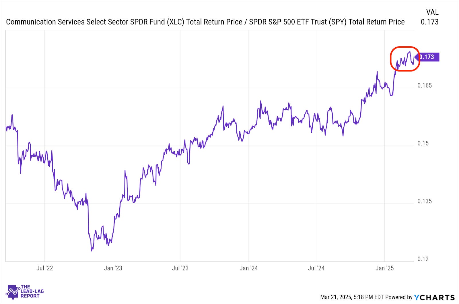
Even though market sentiment has turned modestly more positive and investors have shifted away from more defensive investments, growth areas of the market have not been the beneficiaries. Even though the mag 7 collective continues to lag here, the telecom sector is still holding up. I expect the mag 7 component of this sector will have some trouble contributing to positive returns as long as the growth outlook is depressed.
Materials (XLB) – Strong Start
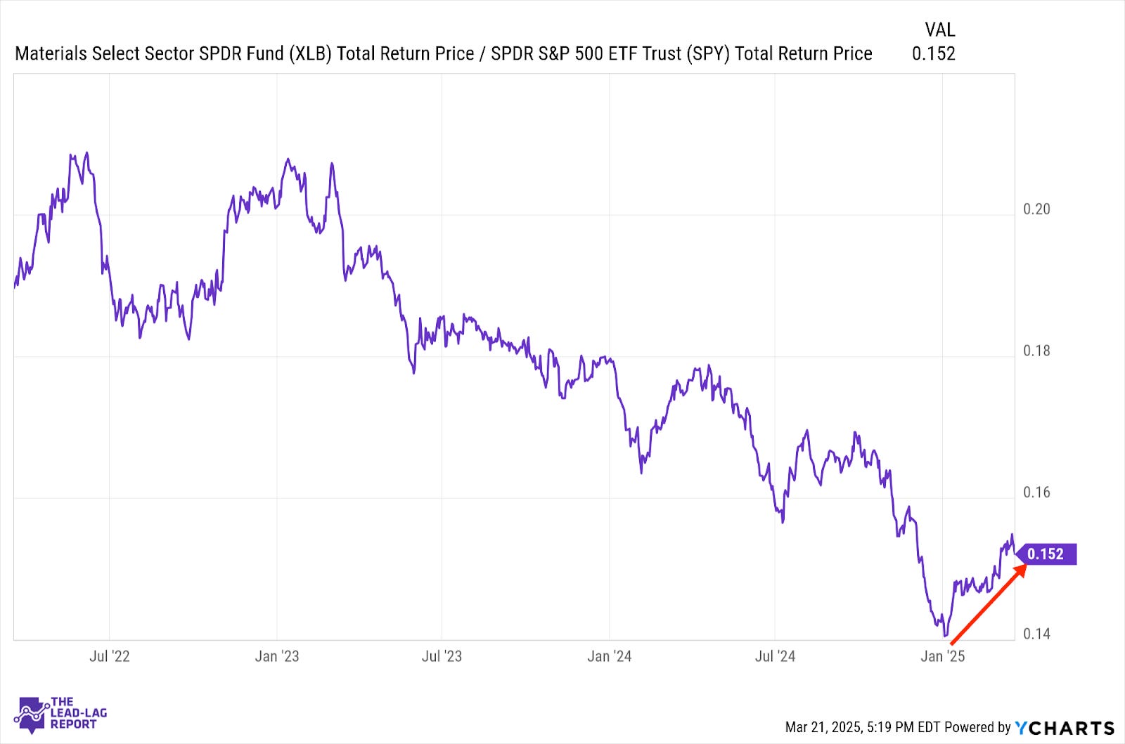
Materials stocks have had a strong start to 2025. The threat of tariffs is meant to increase domestic materials production and that may be adding a boost to the sector, but the value aspect of this group may be the differentiator. The market has expressed a firm dislike for anything considered expensive and materials do not fall in that group.
Industrials (XLI) – Violent Ups & Downs
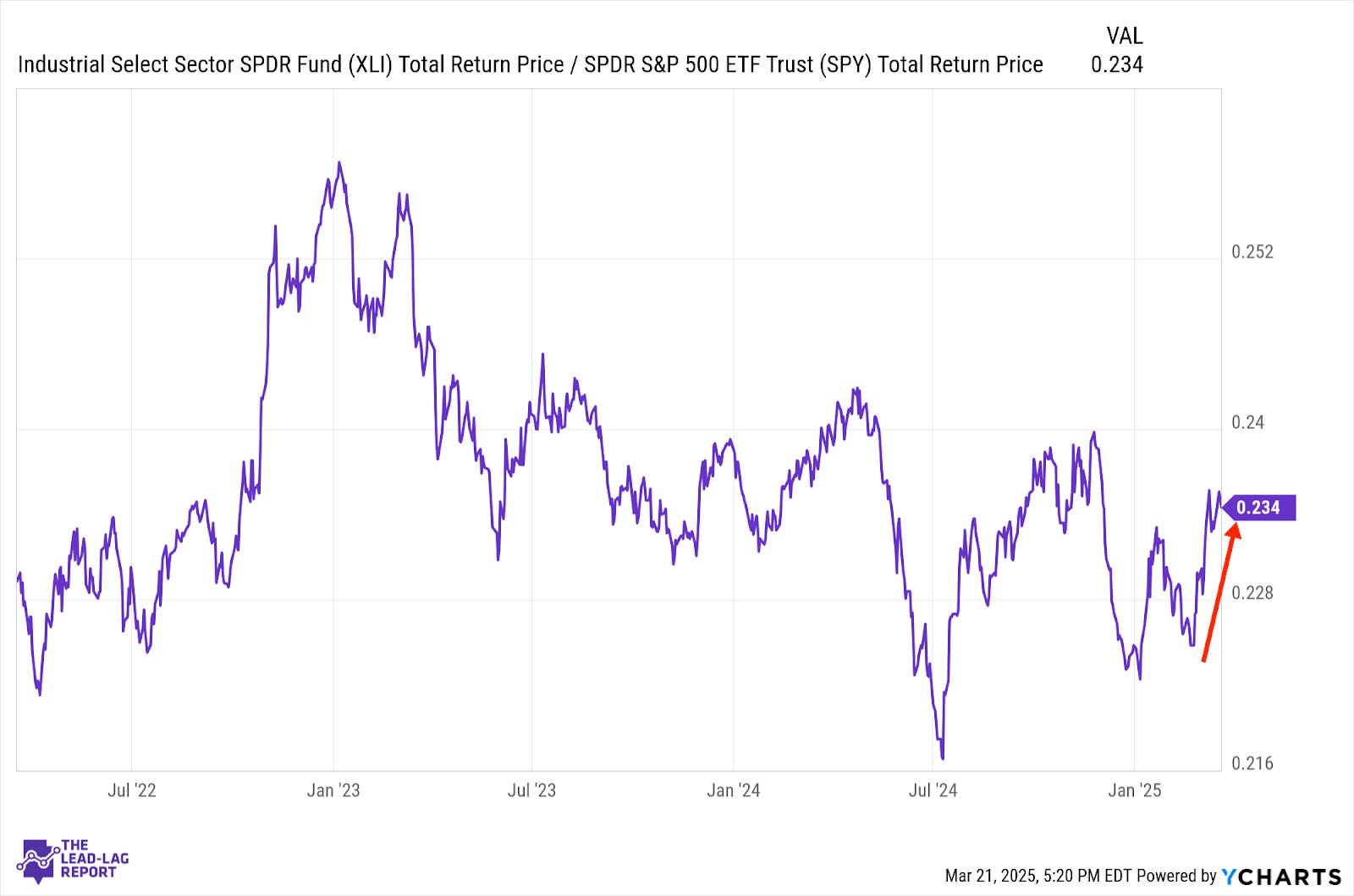
Perhaps no ratio is reflective of the ups and downs of tariff policy than this one. Industrials have a modestly improving manufacturing environment working in their favor, but the uncertainty surrounding the trade war continues to create a lot of volatility. As long as we keep getting threats, escalations and the market trying to figure out what the path is, I expect more whipsaws ahead.
Energy (XLE) – Supply Dynamics In Control
