

Below is an assessment of the performance of some of the most important sectors and asset classes relative to each other with an interpretation of what underlying market dynamics may be signaling about the future direction of risk-taking by investors. The below charts are all price ratios which show the underlying trend of the numerator relative to the denominator. A rising price ratio means the numerator is outperforming (up more/down less) the denominator. A falling price ratio means underperformance.
LEADERS: CYCLICALS LEAD THE WAY, BUT NOT ALL OF THEM
Consumer Discretionary (XLY) – Sentiment Pessimistic, But Spending Resilient
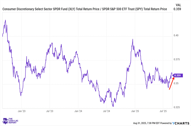
Consumer discretionary stocks have been recovering nicely following the Powell pivot and solid personal spending data showing a 0.5% increase in July. The disconnect between how consumers feel and how they actually behave continues to widen. Sentiment remains pessimistic while spending stays resilient. Several major companies in the sector recently reported positive earnings, but provided weaker forward guidance, suggesting corporate forecasts are beginning to factor in potential softening ahead.
Communication Services (XLC) – Mixed Performance
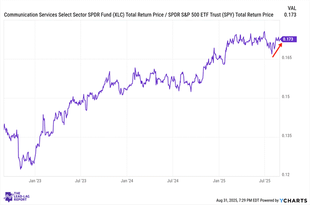
Communication services experienced some increased volatility after months of this ratio moving sideways. The sector’s mega-cap components continue to navigate AI investment challenges while more defensive holdings create a mixed performance profile. With market leadership broadening beyond tech giants, this sector appears caught between the growth and defensive camps without a clear catalyst for outperformance.
Financials (XLF) – Healthy Participation Following Powell Pivot
